- Katarina Anik
- (AU/DK) Graphic Designer
- Copenhagen — Melbourne/Sydney
-
Isn’t it funny how these introductions are almost always written in the third person?
My name is Katarina. This is my website. I’m a designer with a strong narrative instinct, working across digital, print, and spatial forms. My skills span identity, brand strategy, editorial, typography, web and digital, motion design and creative coding. I shift between disciplines, but at the heart of everything I do is concept — curiosity, research, disruption and reassembly, responsive to context, and stretched through experimentation.
I was born and raised along the east coast of Australia, with the last 12 years predominately based in Melbourne. This year I moved to Copenhagen for an EU chapter, and honestly, still pinching myself.
Before design, I worked across adjacent creative fields, from the development and performance of contemporary plays, to original devised pieces realised and translated through the Suzuki Method*[Suzuki, for those who don’t speak theatre: a highly stylised acting practice and rigorous physical discipline, drawn from ballet, martial arts, and traditional Japanese and Greek theatre — and yes, it's as mental as it sounds.] to scriptwriting and producing within the independent film industry. To say it simply, I’m someone who has an insatiable appetite for ideas, process, and expression.
Key offerings are defined, but the possibilities are vast. For commissions, collaborations, coffees and conversations, reach out via the links below.
—K
Last updated: 11 September 2025
- Email(katanik dot des at gmail dot com)
- Instagram (katanik double underscore)
- Now
- Freelancing
- Education
- University of Melbourne
- BDes, Double Major in Graphic Design & Performance Design
- —
- Københavns Universitet
- Exchange
- Selected Projects
-
-
Experimental Type
Motion
-
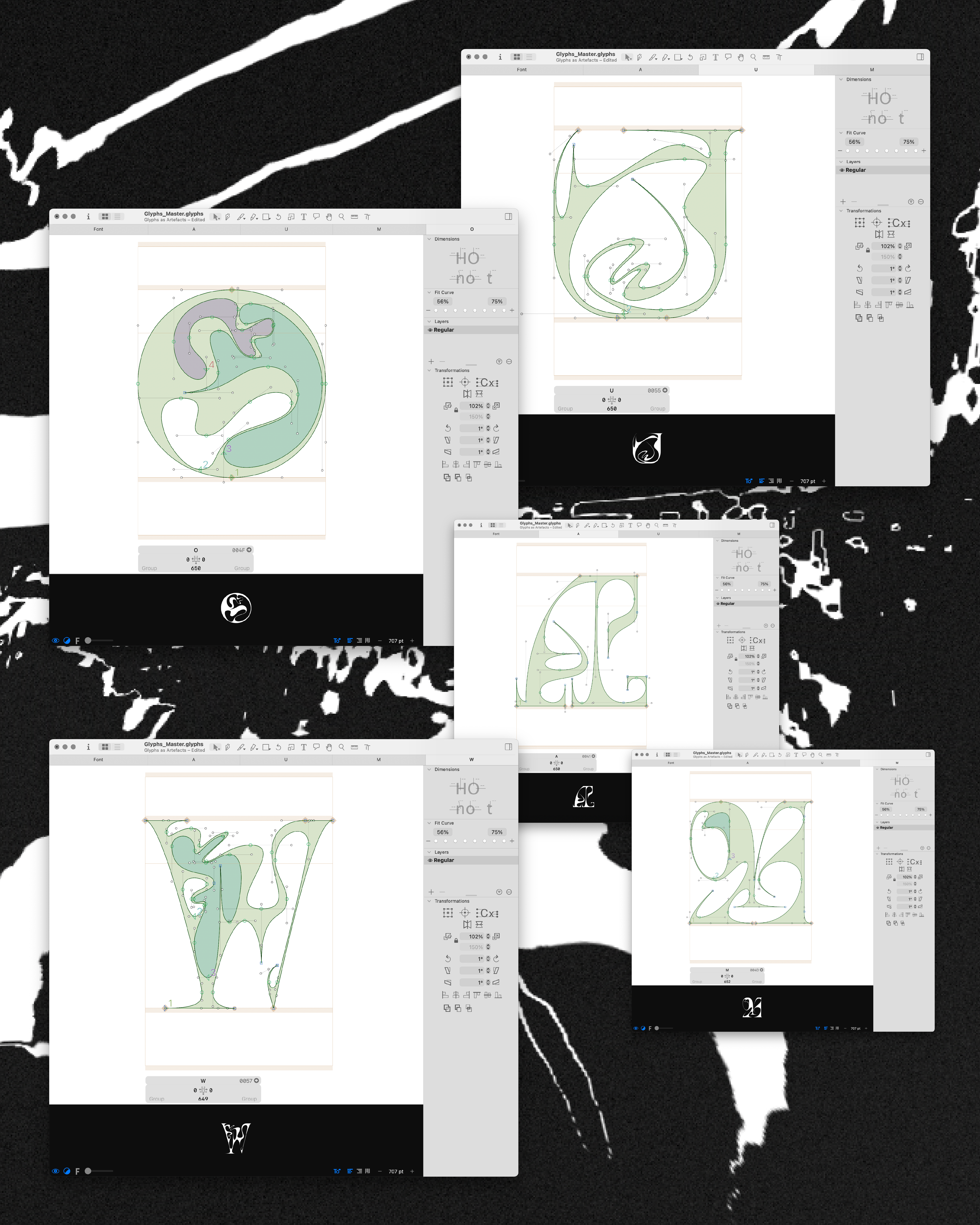
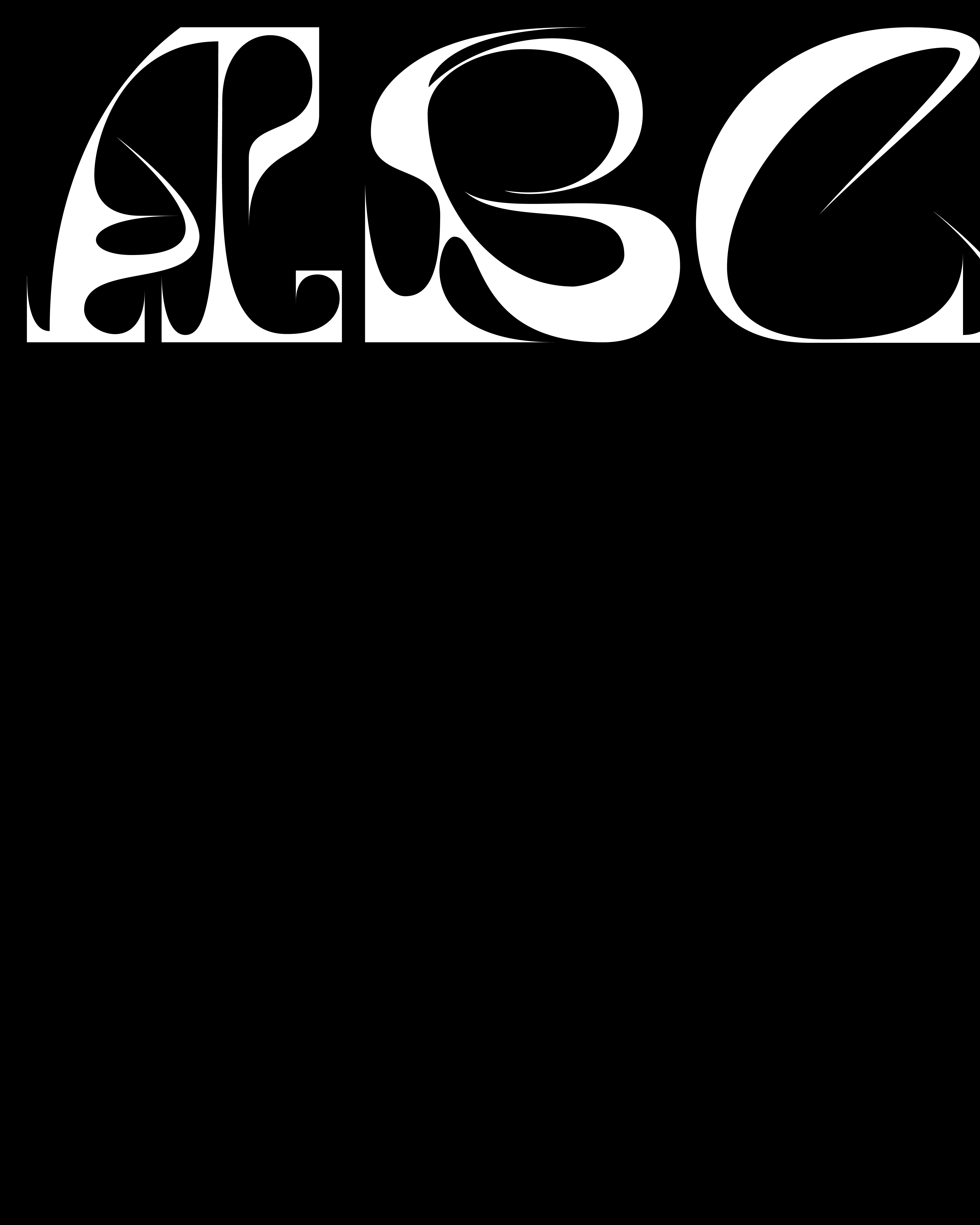
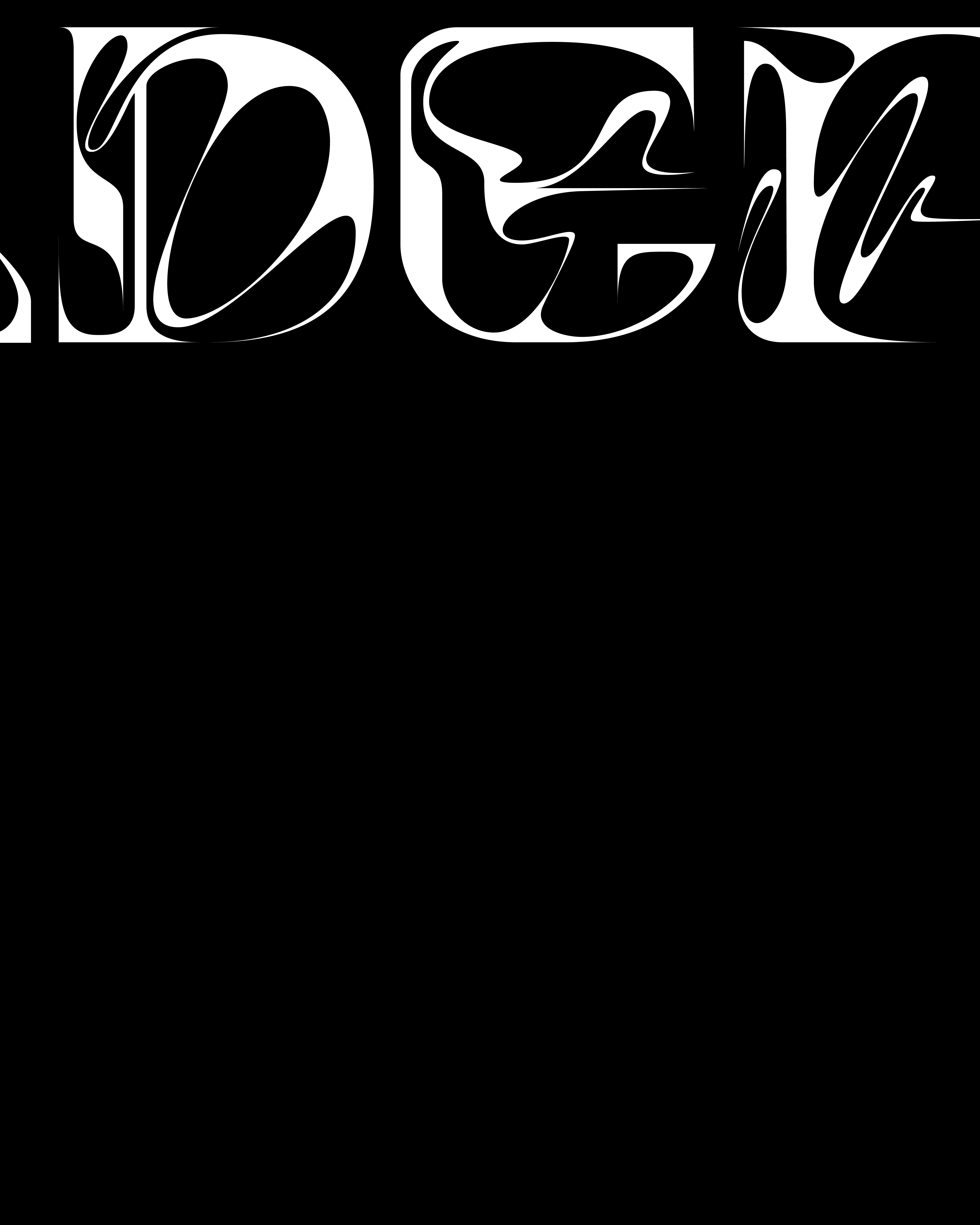
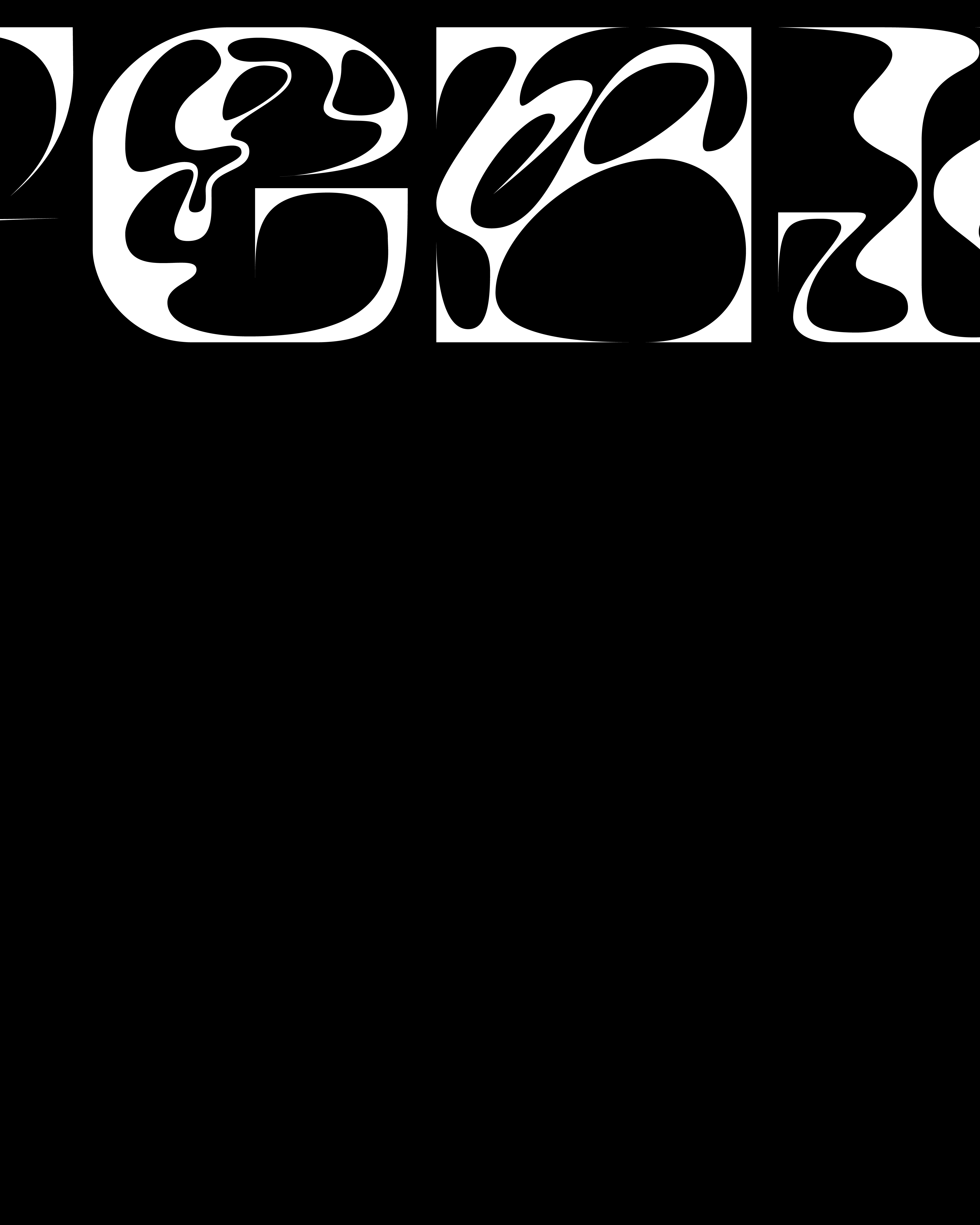
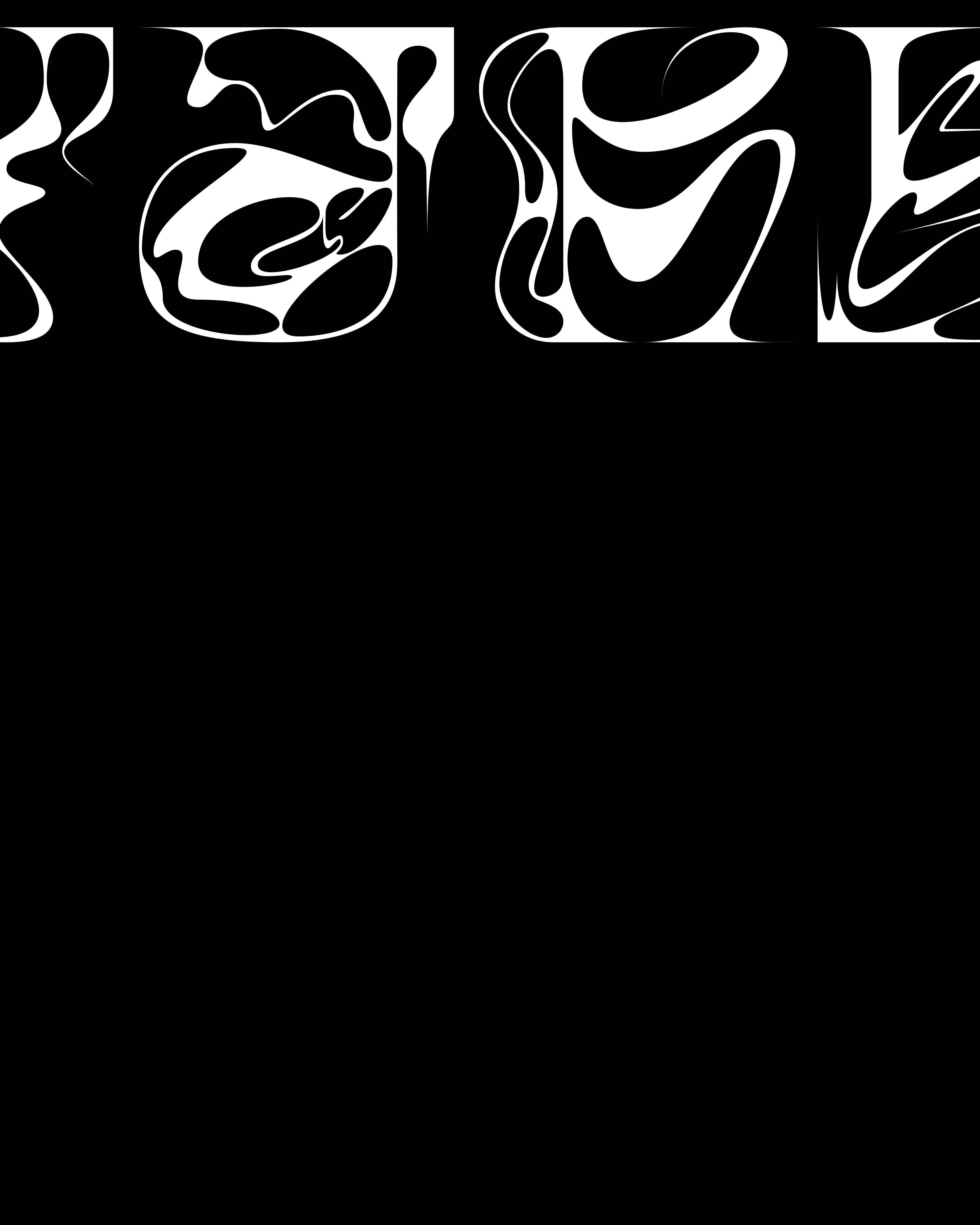
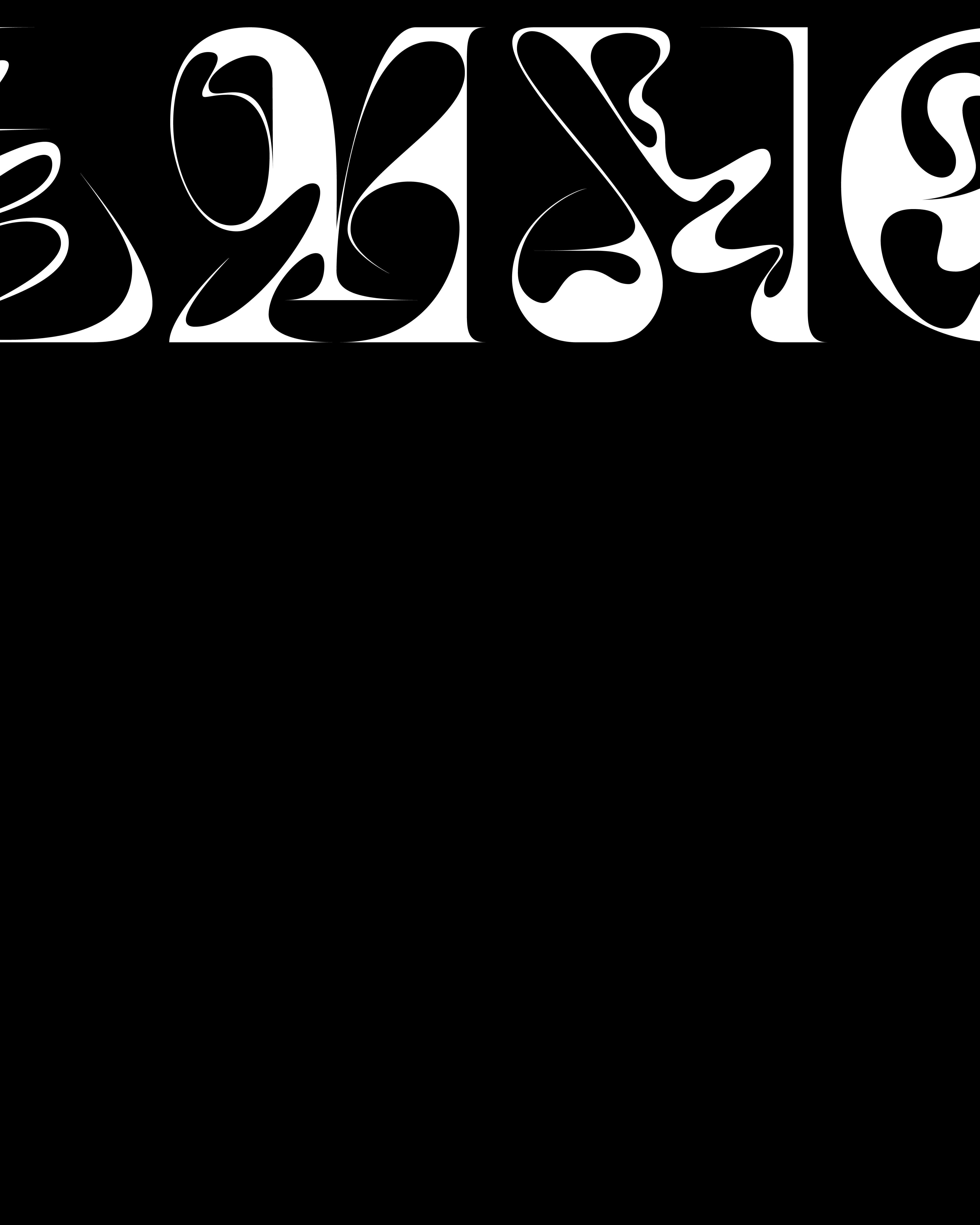
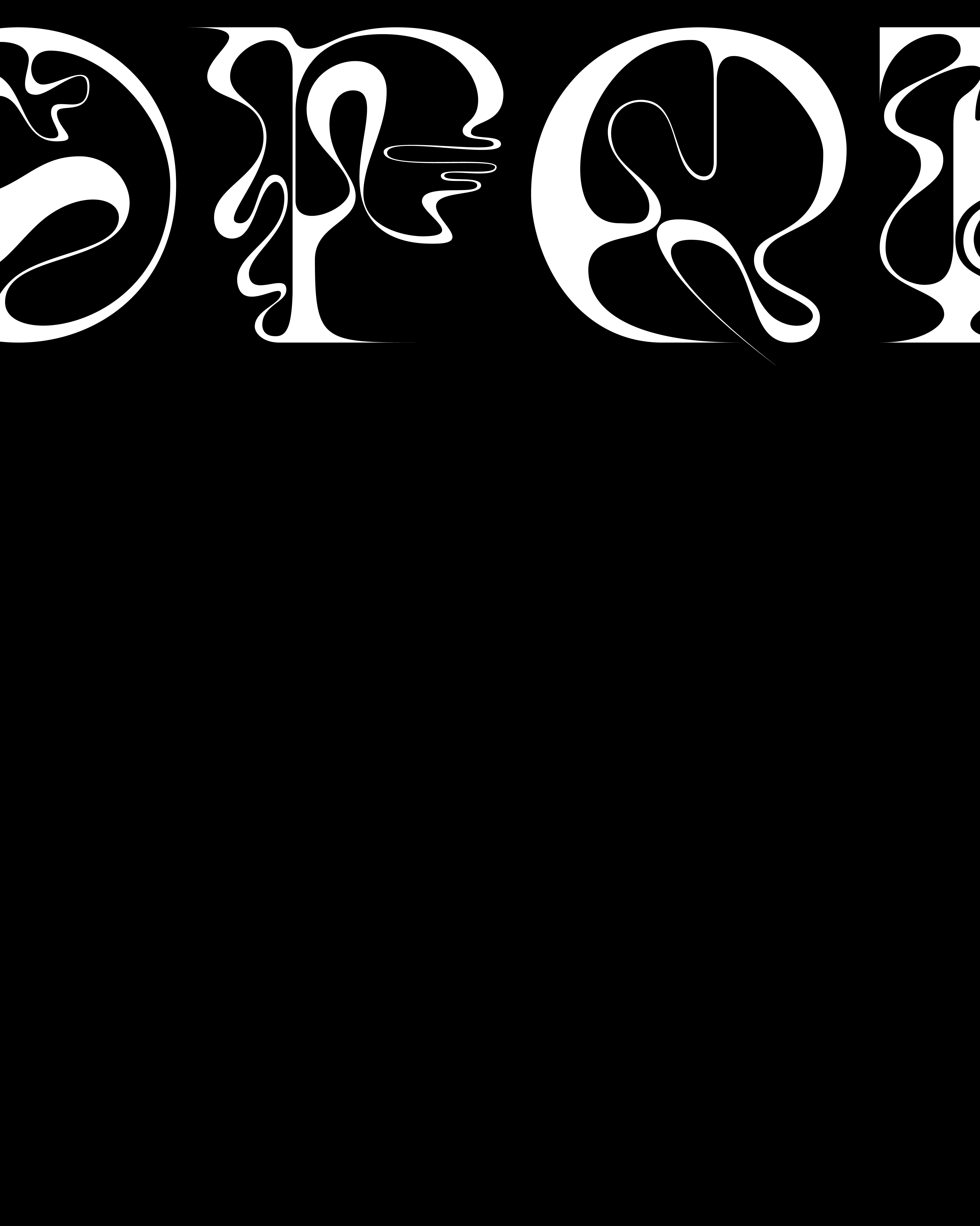
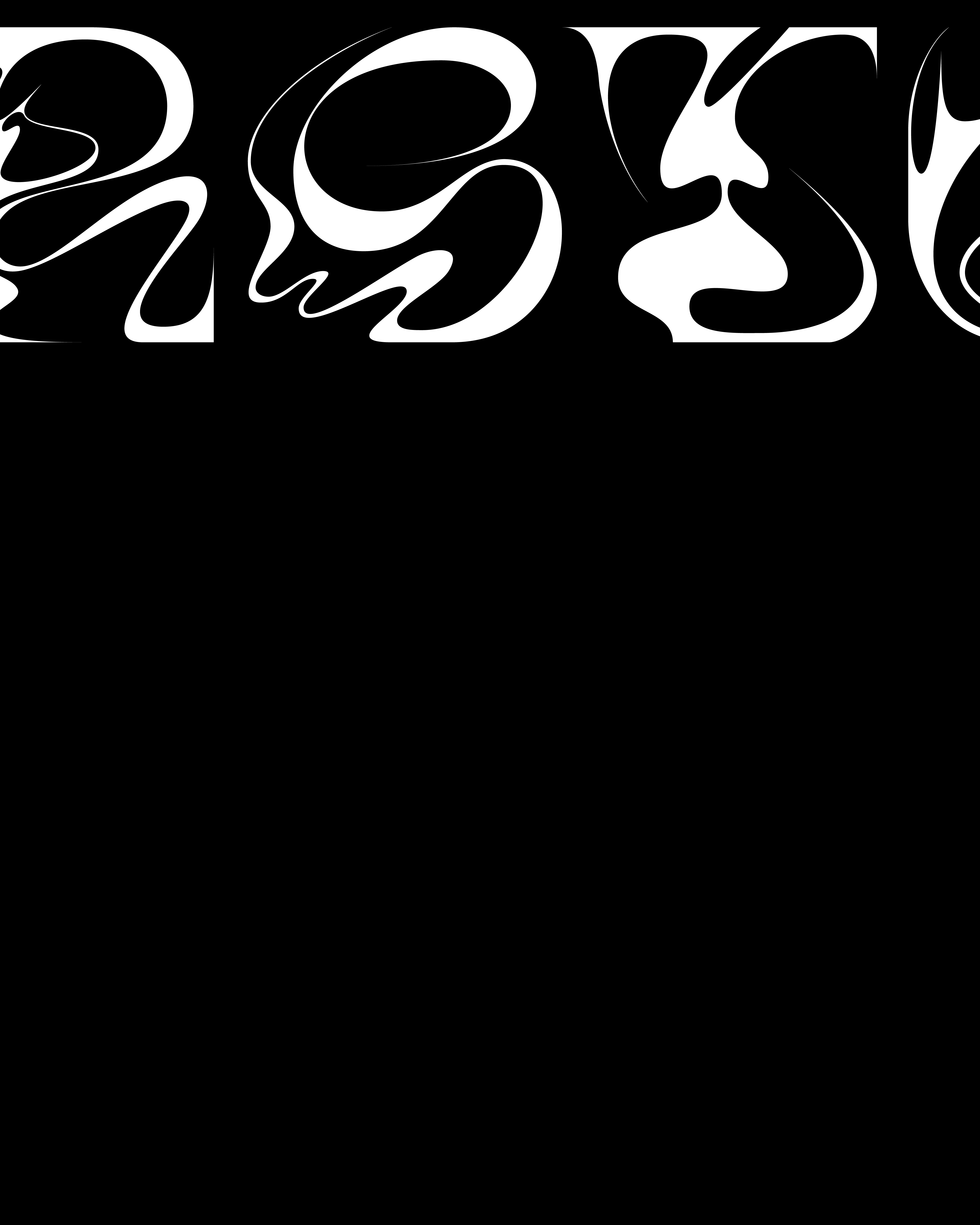
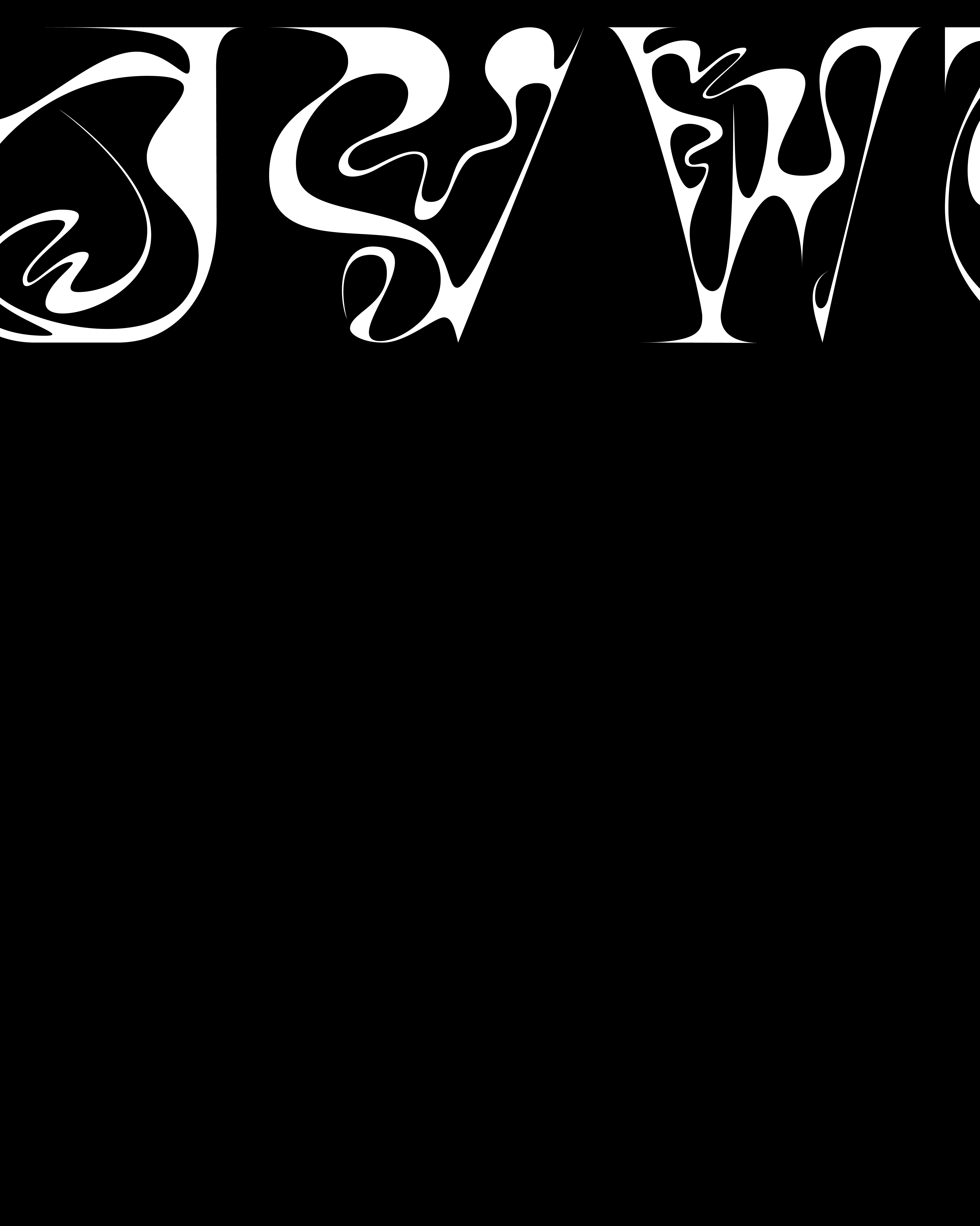
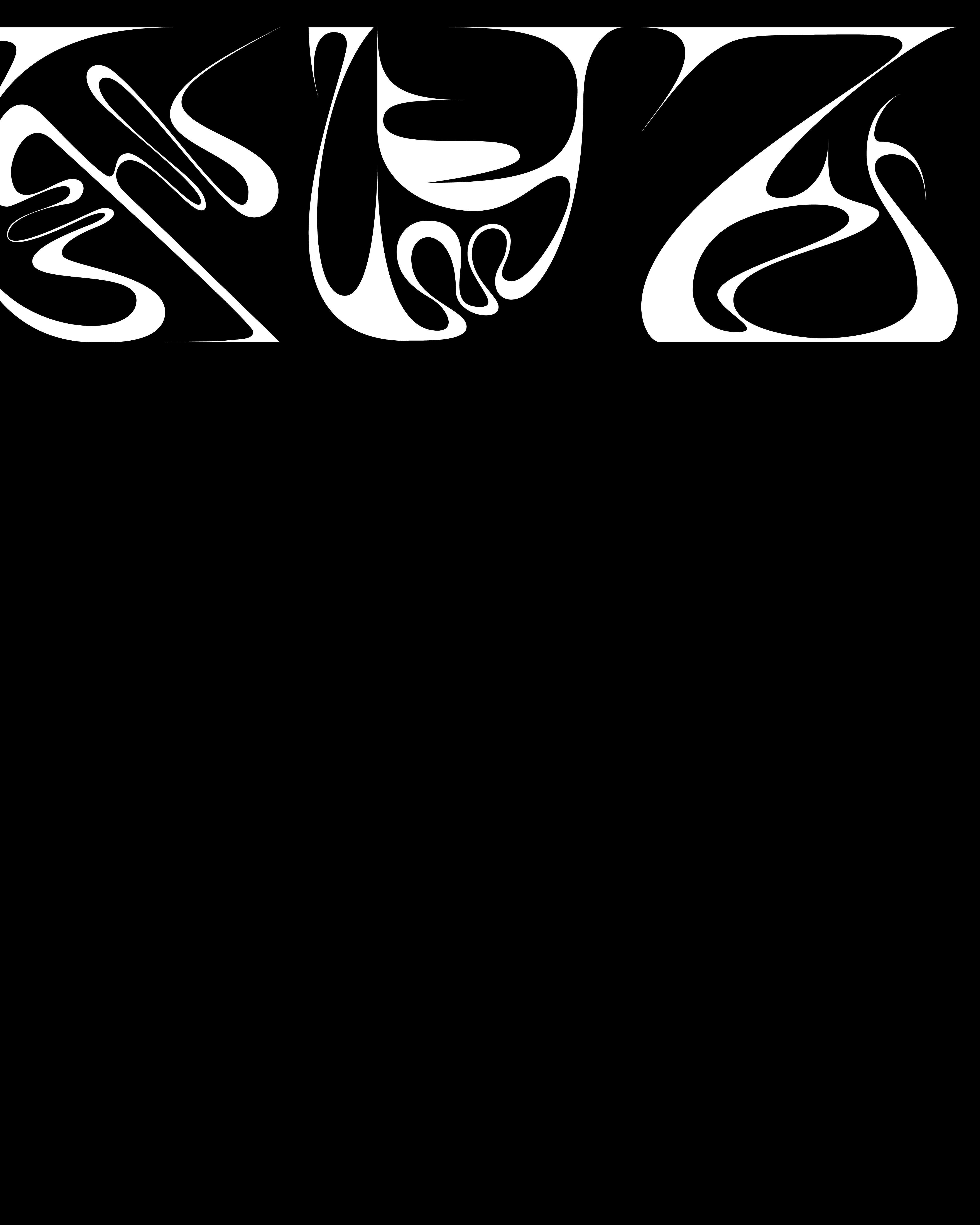
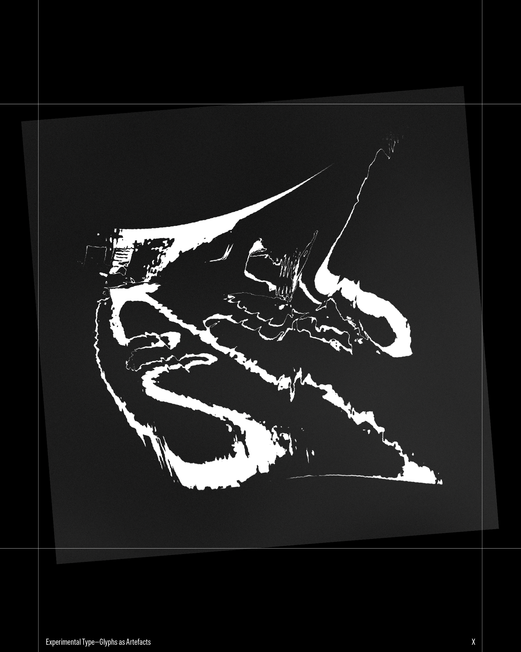
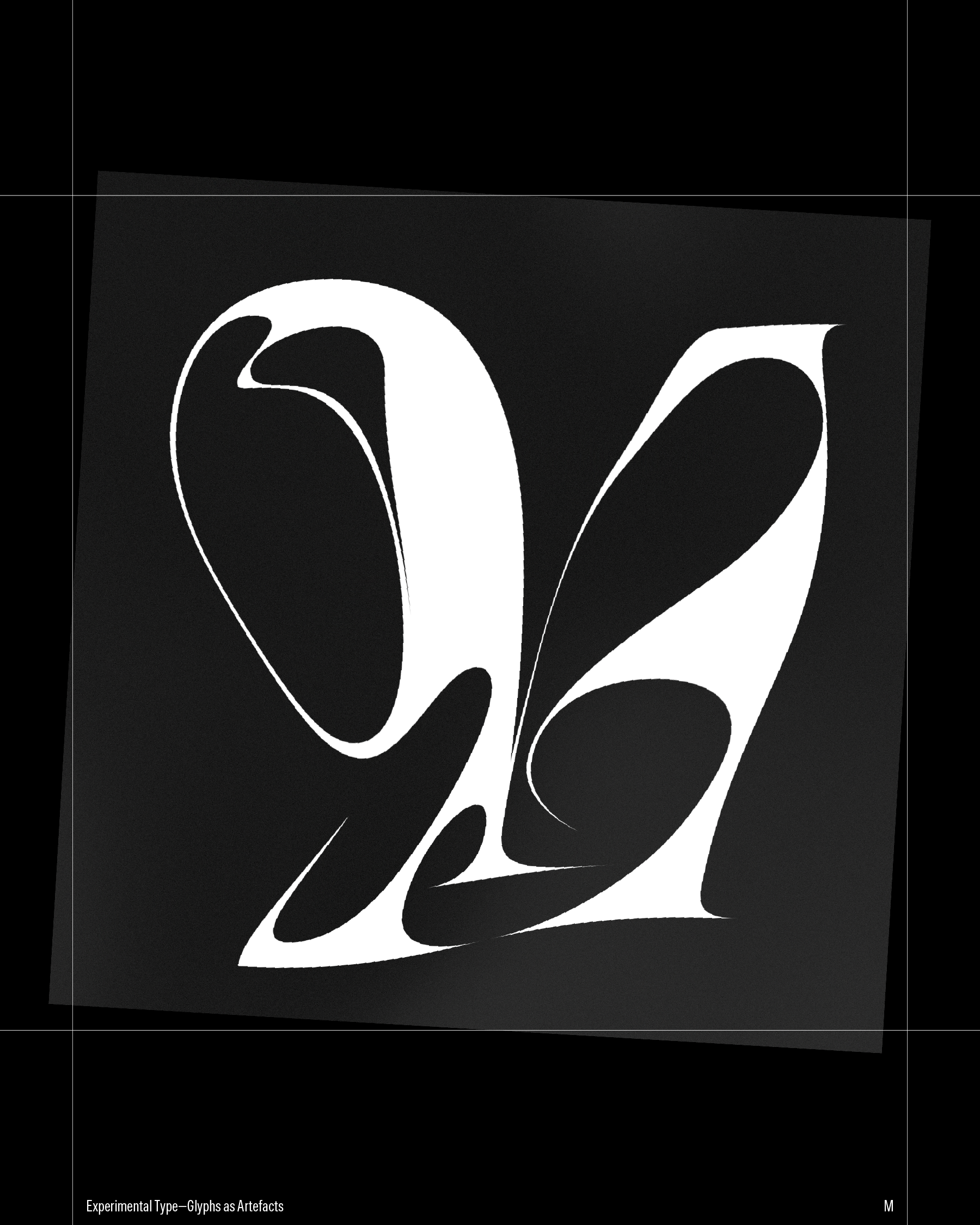
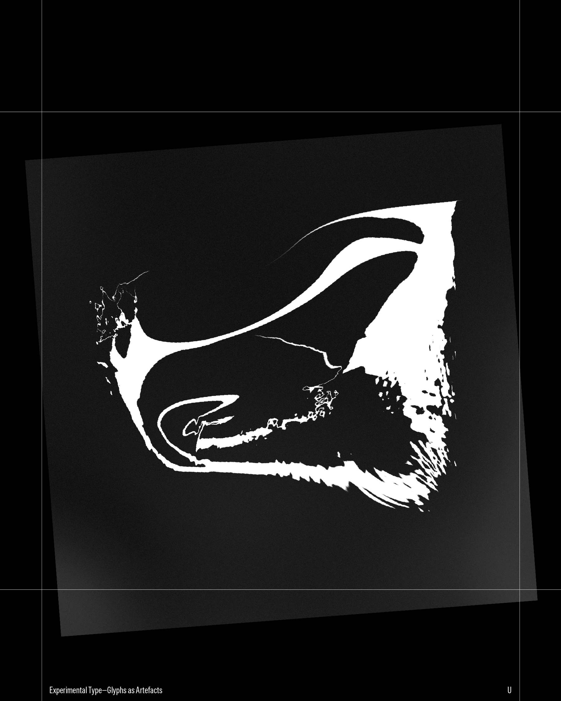
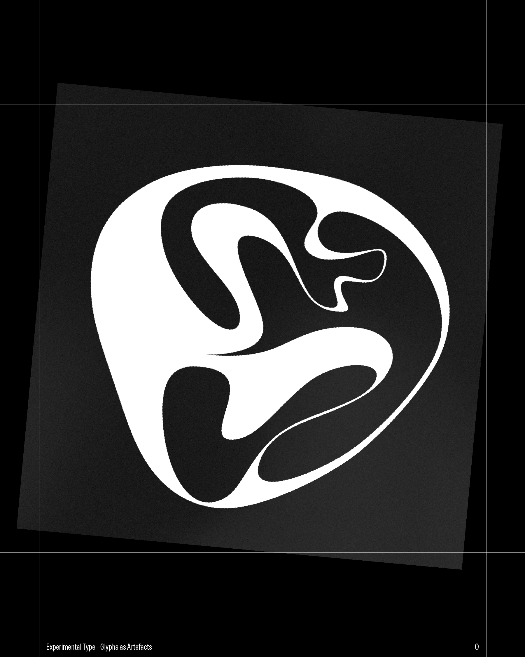
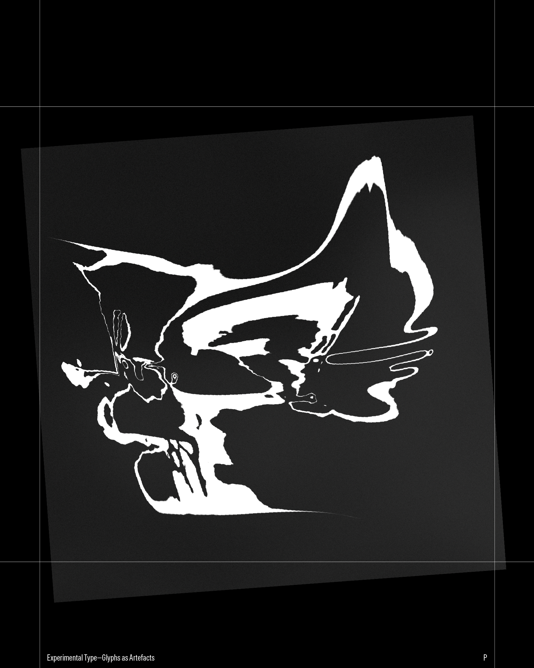
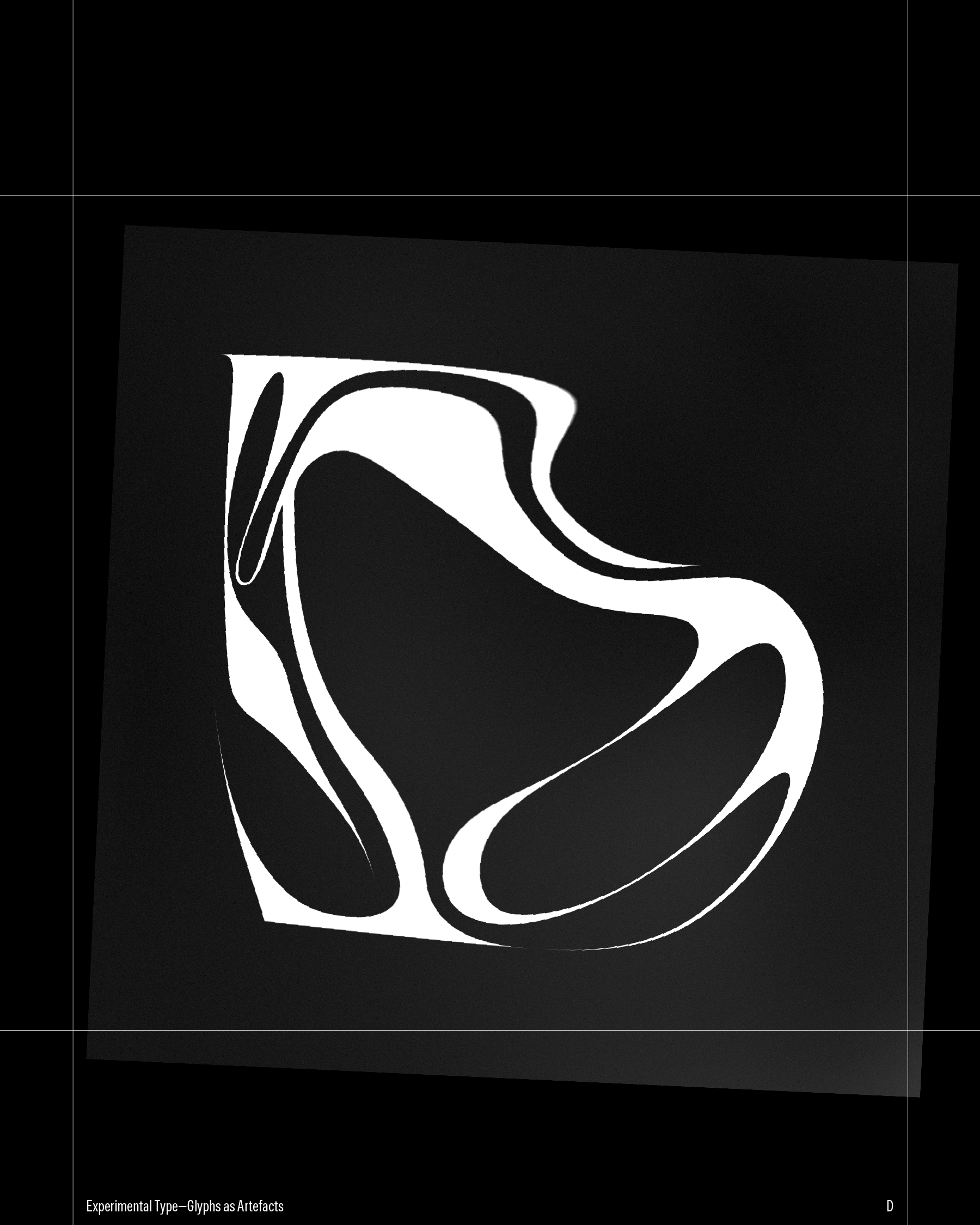
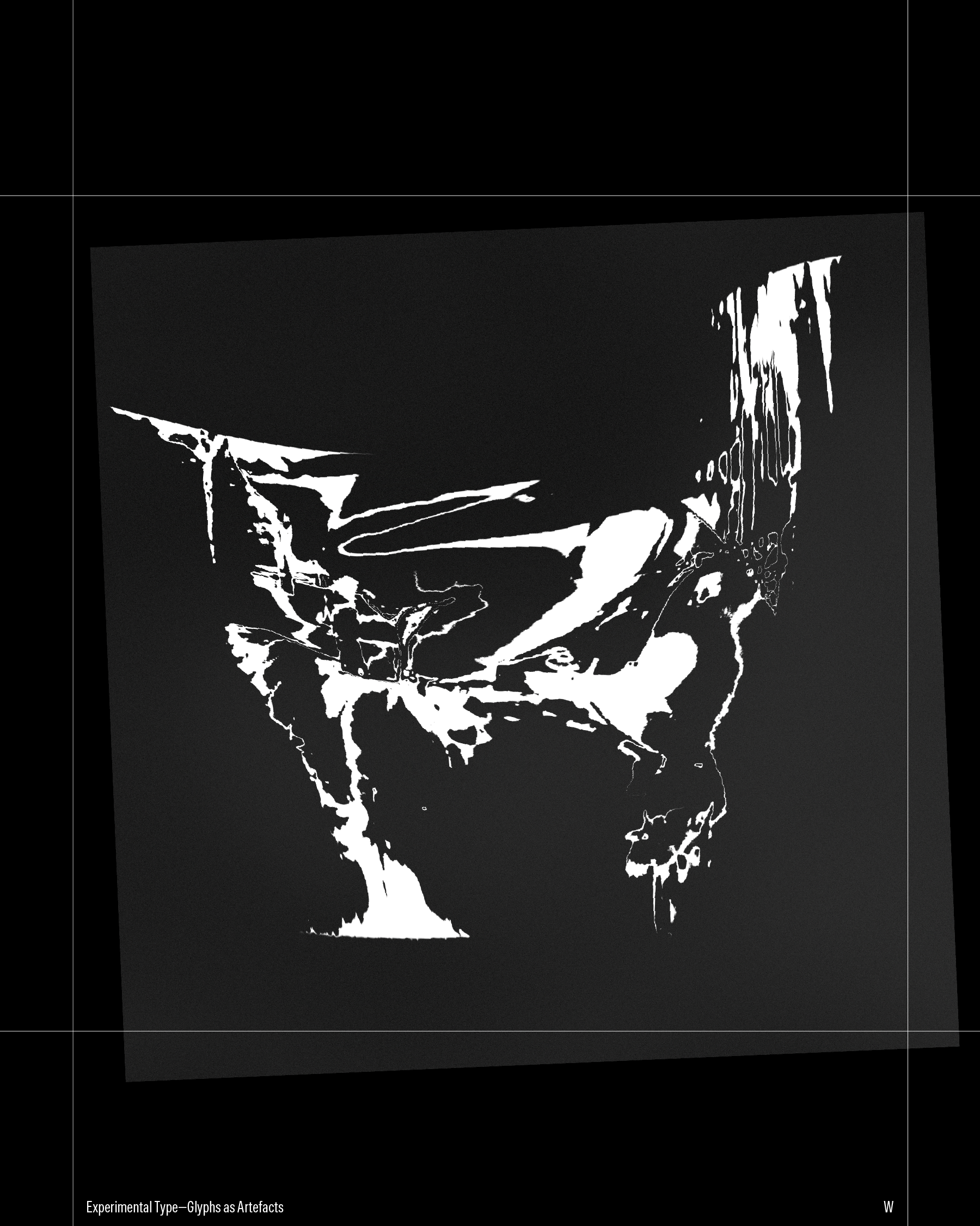
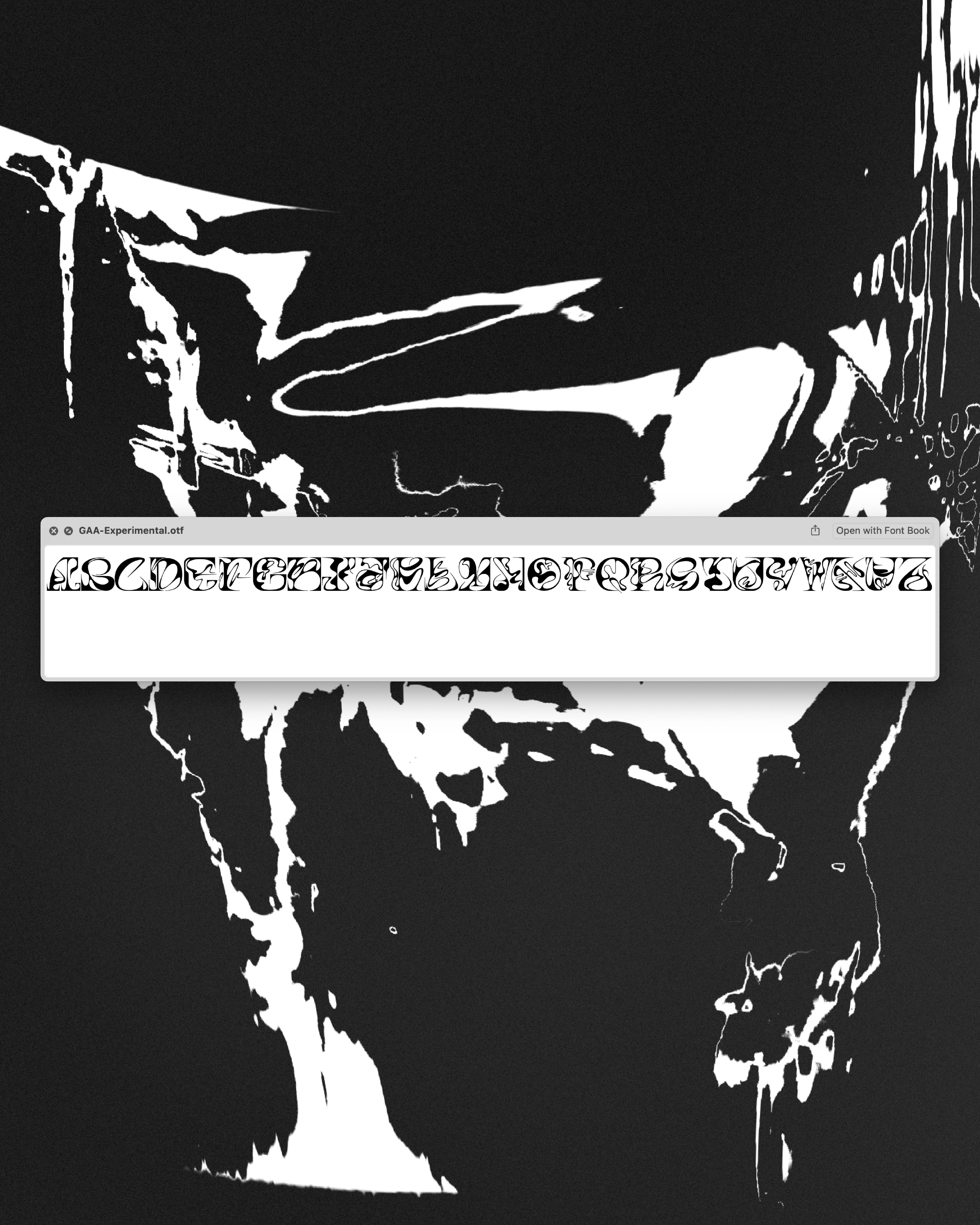
Glyphs as Artefacts
An experimental typeface shaped by memory — independent capstone project.
Glyphs as Artefacts is an experimental typeface that embraces a transdisciplinary approach, intertwining in-depth personal reflection with the physical act of design. Memories infuse each glyph with meaning, forming the basis of a typeface that serves as both a visual record and an embodiment of lived experience.
The process began with a method I used in performance — a way of working from an authentic, moment-to-moment place. It centred on active verbs: to hijack, to relish, to warn — used to unlock memory and emotional entry points into the text. I translated that same approach into type design — each letter triggered a word, each word a memory. I followed the thread, gave it voice. Recorded. Transcribed. Externalised. I then took the memory to paper, letting form follow feeling.
Once the glyphs felt resolved, I digitised and refined. The final outcome: an experimental uppercase typeface and an audiovisual piece — a looping, 26-minute sequence cycling through each letter, never static, always in flux, accompanied by sound design — panning, droning, dissonant — drawing you through a space of rupture and recall, where memory falters and reconnects. -
-
Identity
Motion
Creative Coding
- designX 24
-
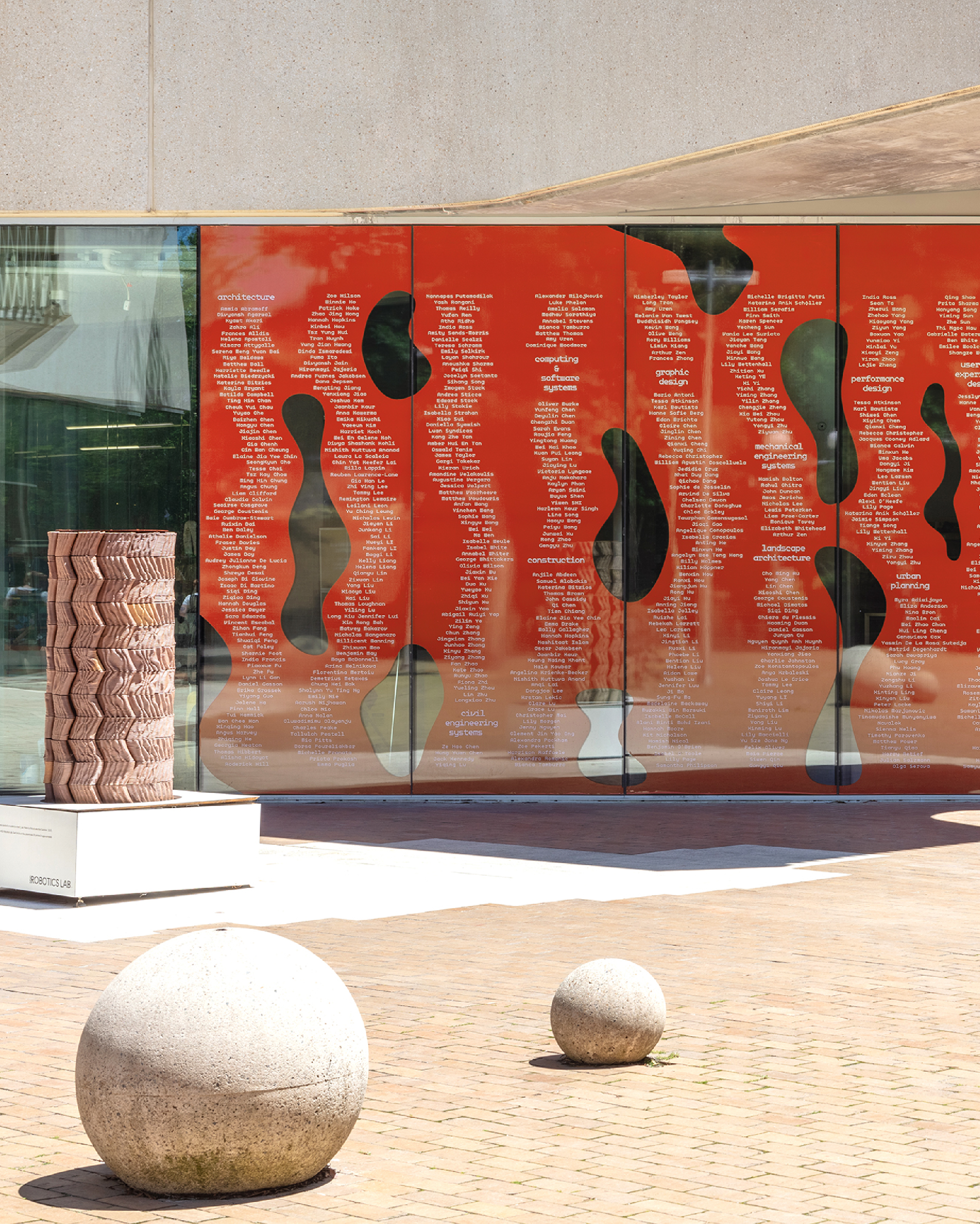
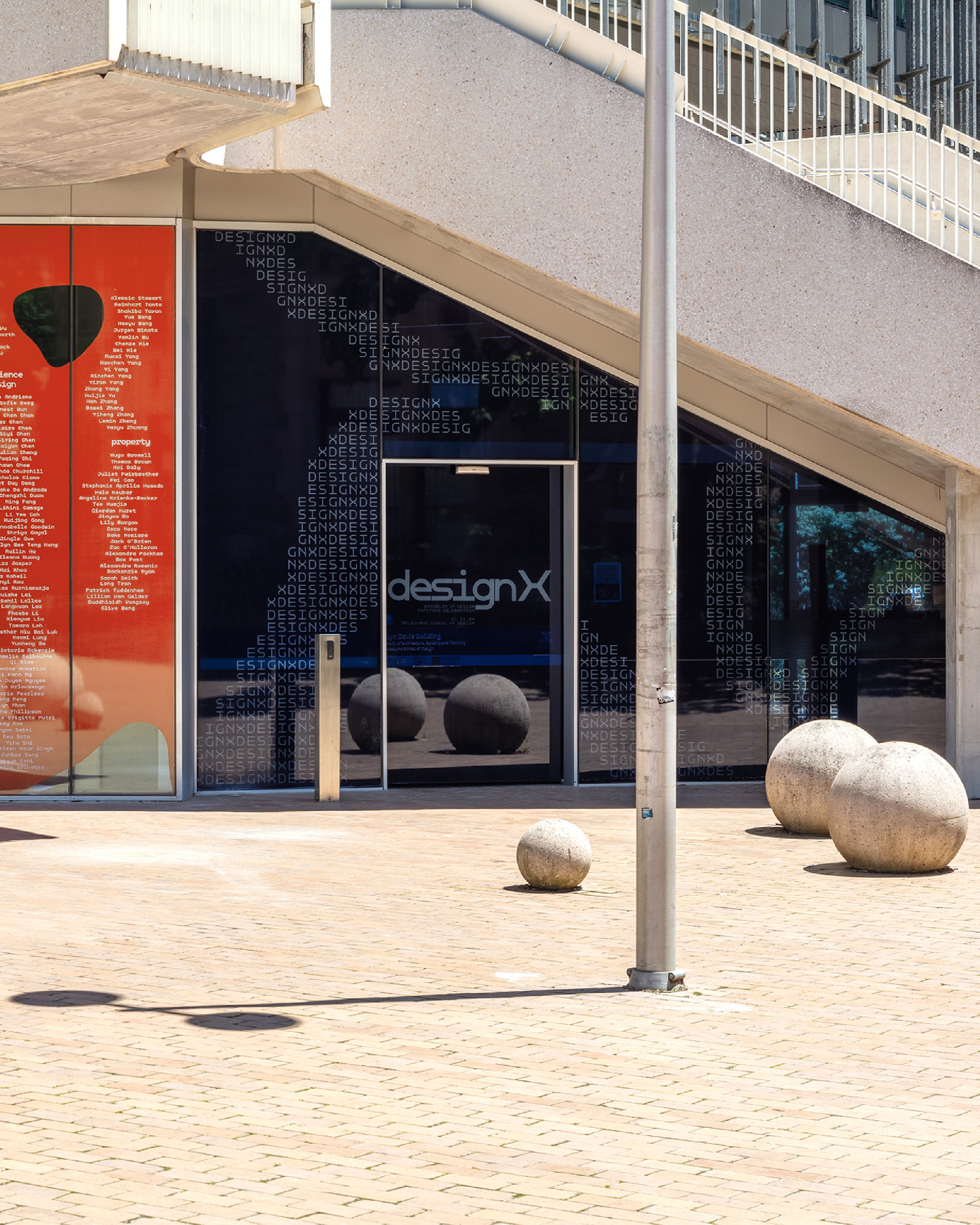
Visual identity for the Melbourne School of Design's annual end-of-year exhibition.
In my final year, I was one of four students selected to develop the visual identity for designX 24 — an annual exhibition celebrating graduates from all twelve pathways of the university’s Bachelor of Design.
With our team managing every aspect of the exhibition’s digital and physical presence — from social media assets and printed collateral to large-scale exhibition graphics — our goal was to translate this celebration into an energetic and seductive visual experience that resonated across all touchpoints.
While the work was highly collaborative, I took the lead on creative coding — developing custom code-based visuals that defined the identity’s visual syntax. I was also responsible for designing and delivering all motion and digital assets.
-
-
Editorial
Branding
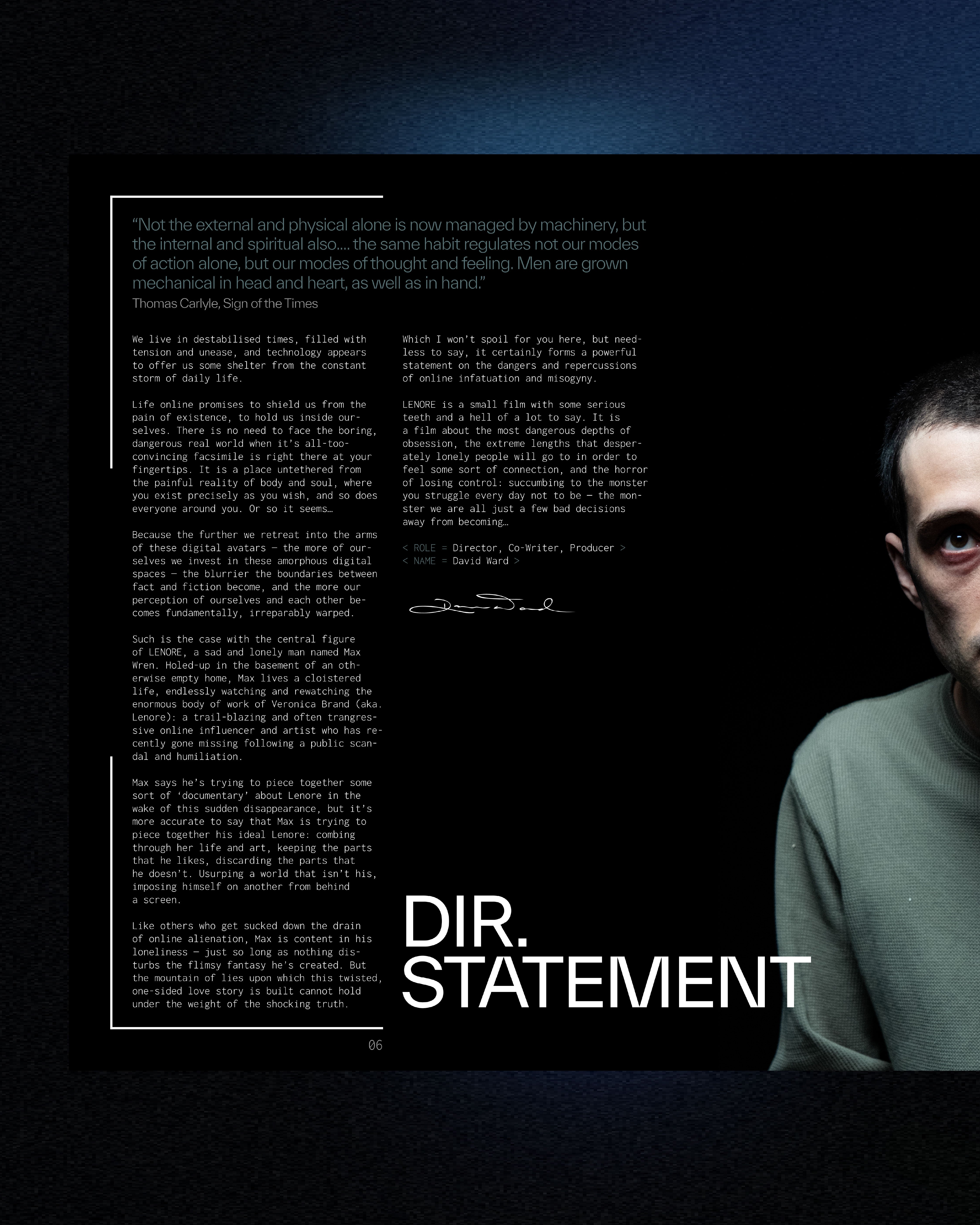
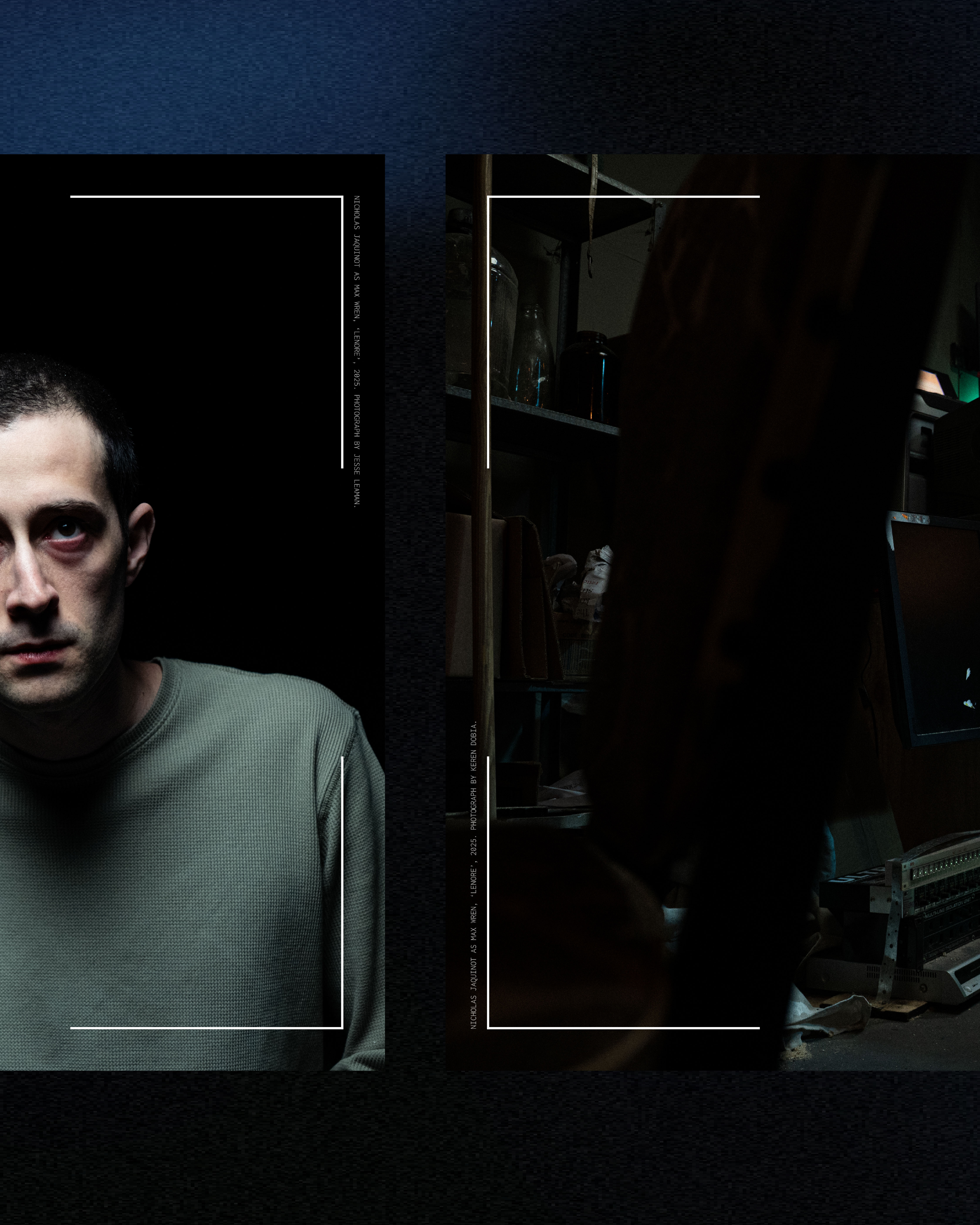
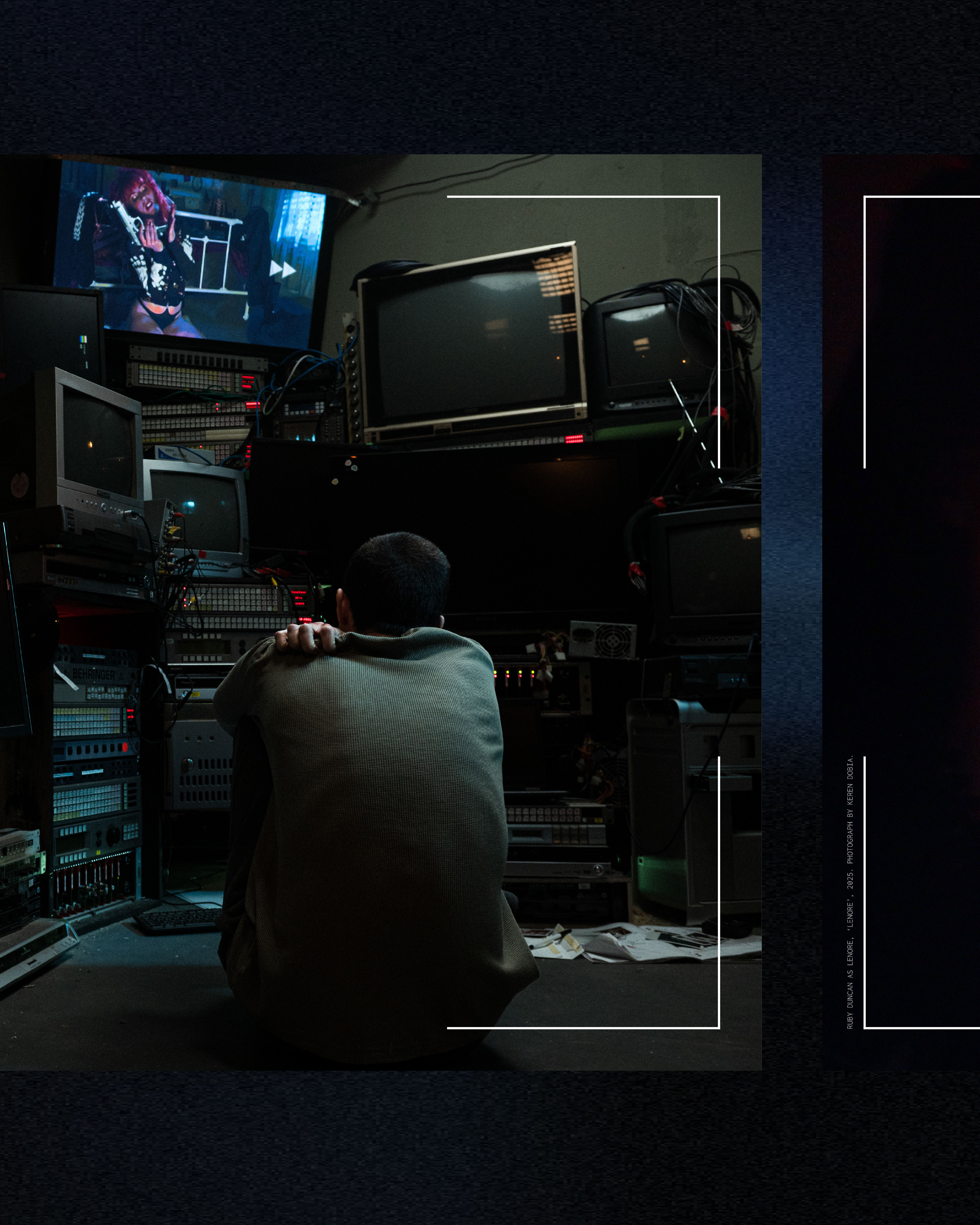
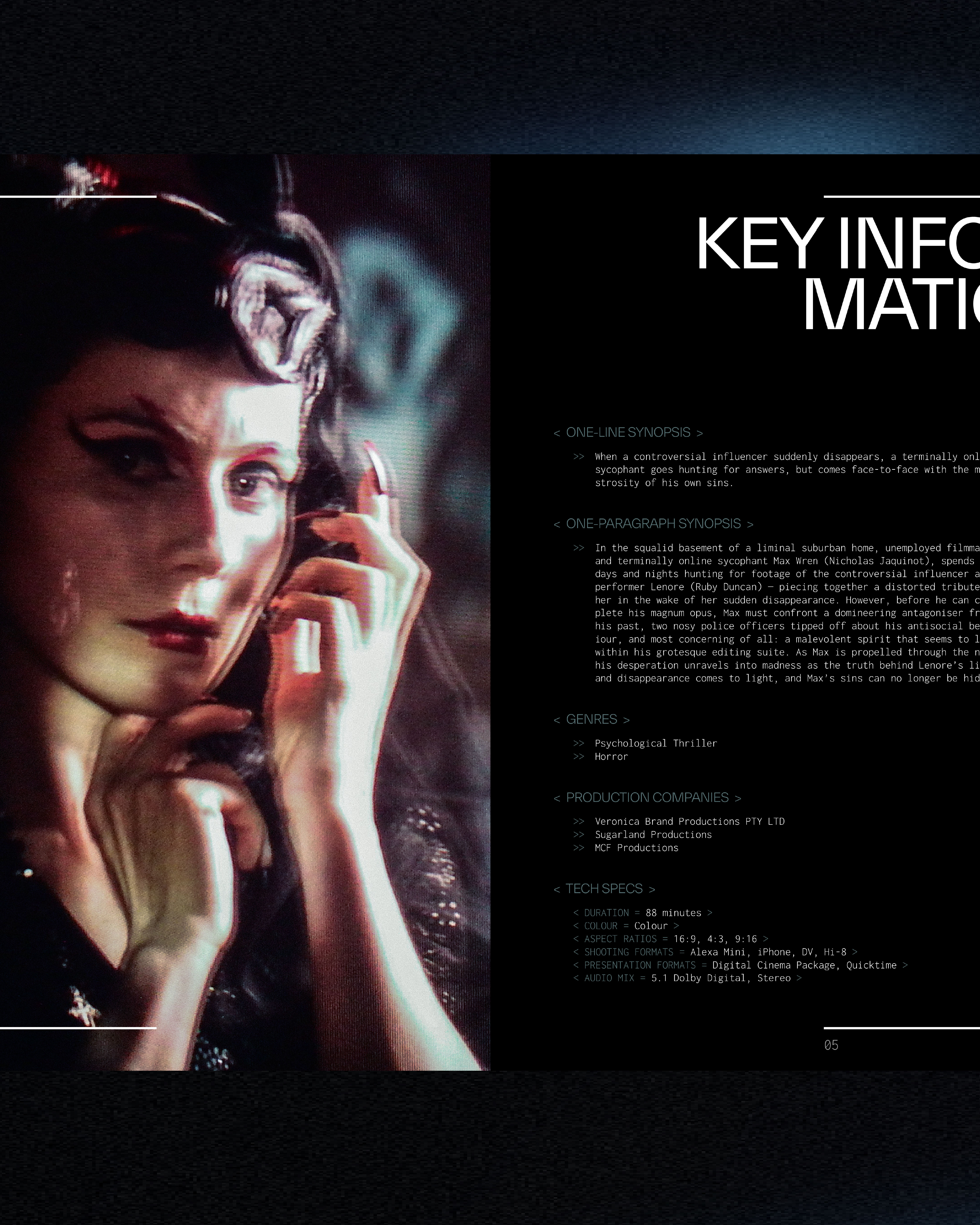
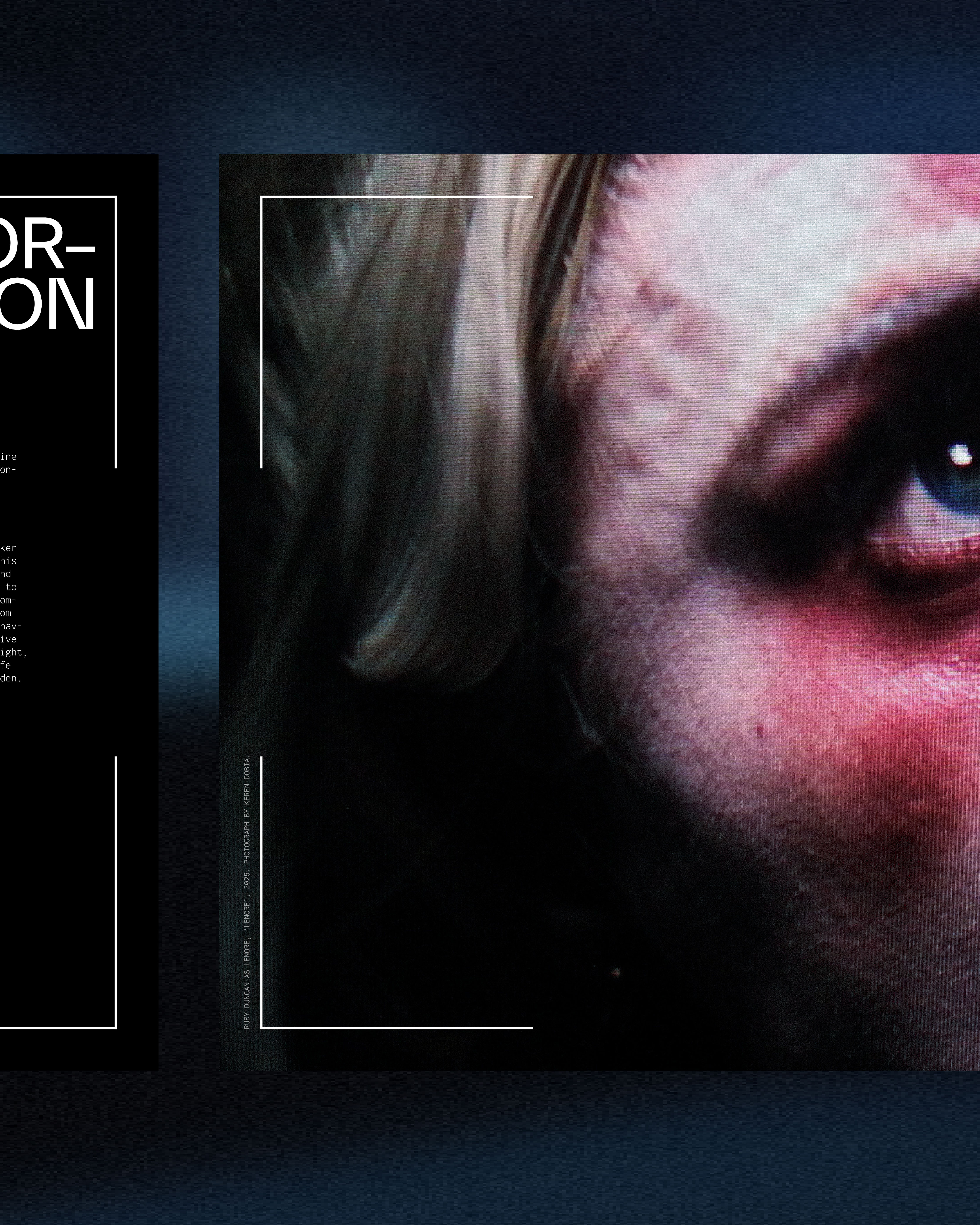
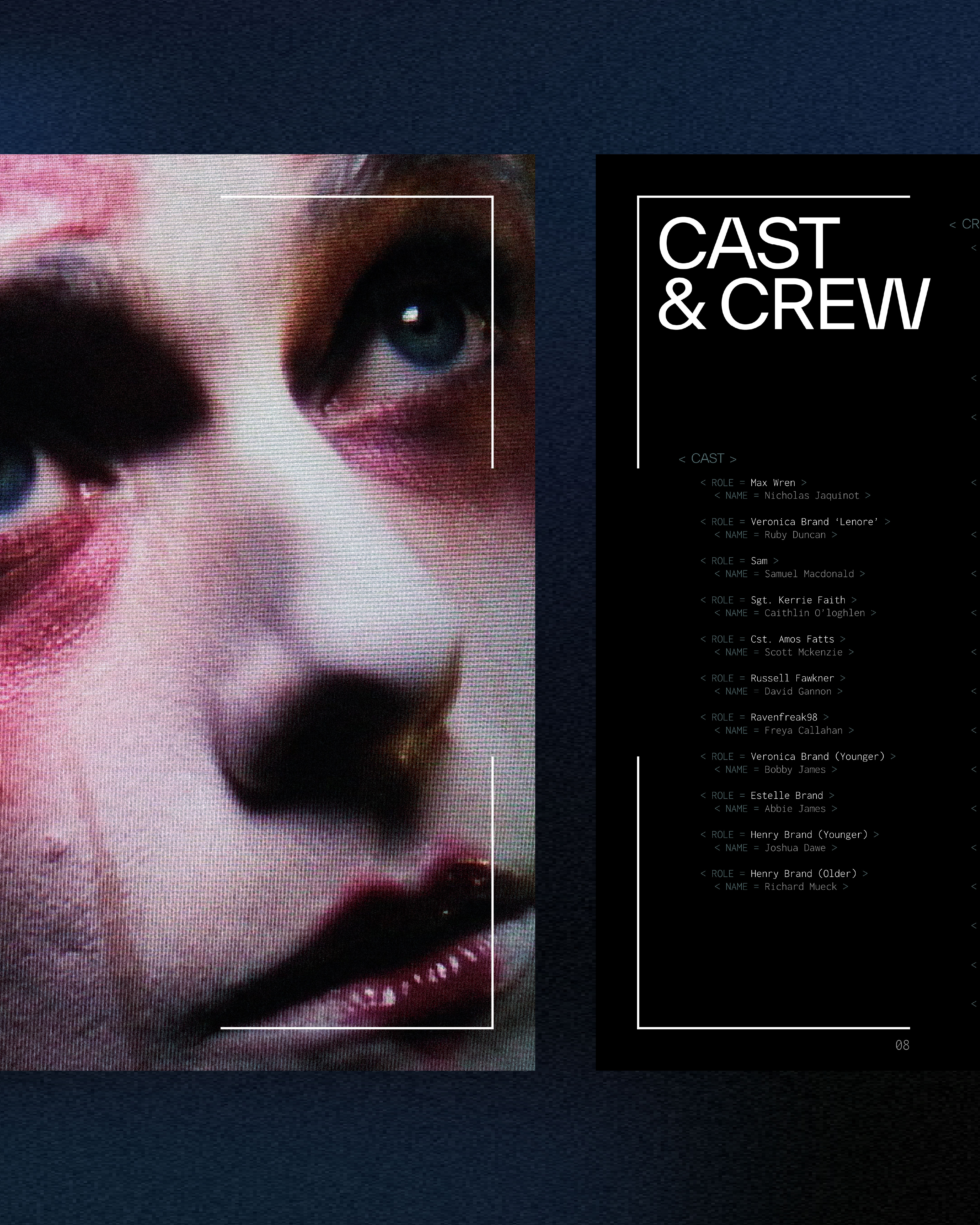
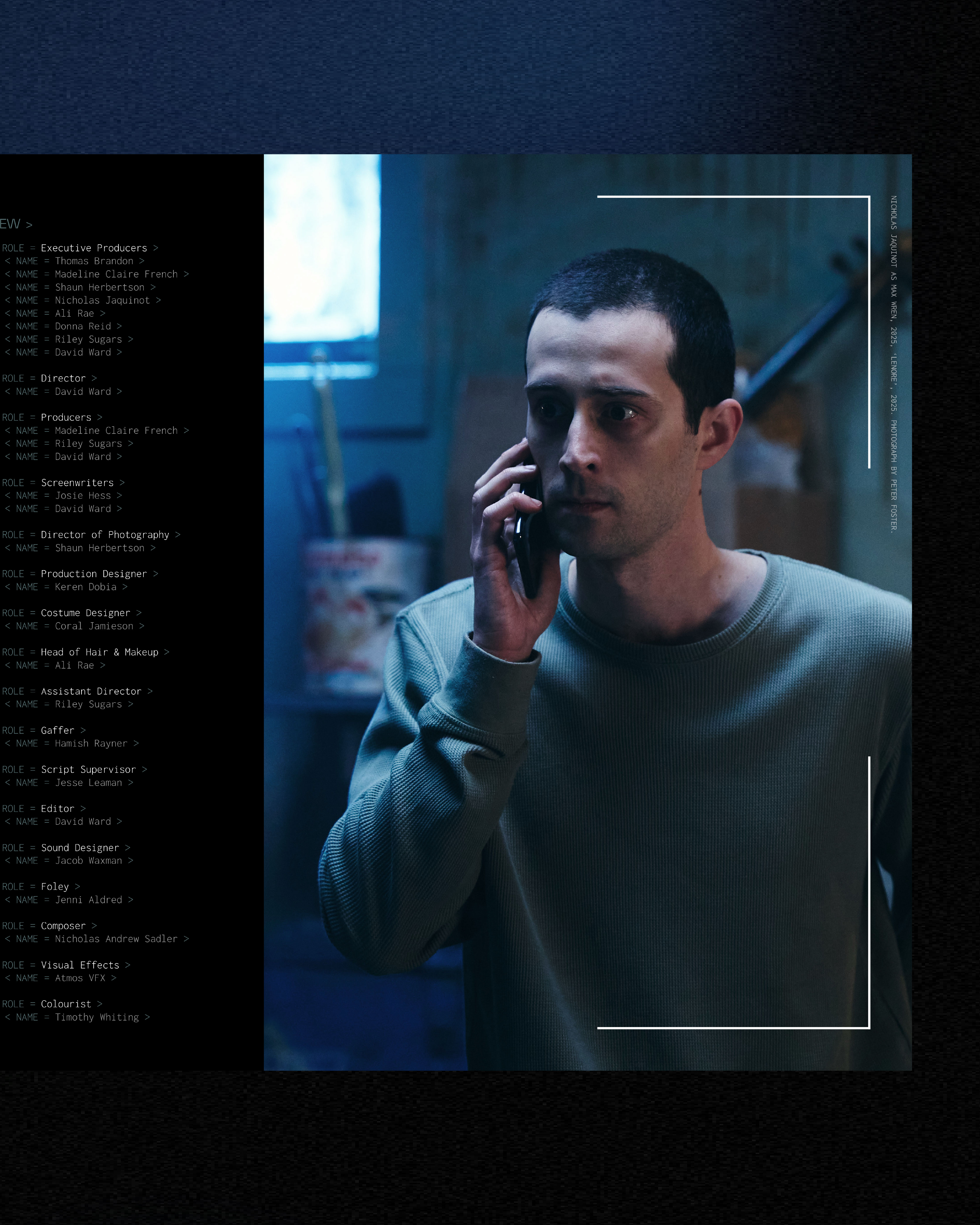
- Lenore, dir. David Ward
-
Electronic press kit — design and development.
"When a controversial influencer suddenly disappears, a terminally online sycophant goes hunting for answers, but comes face-to-face with the monstrosity of his own sins."
Format: Feature Film
Genre: Psychological Thriller, Horror
Film Status: Post-production
-

-
Identity
Branding
- Westgate, dir. Adrian Ortega
-
Film poster — design and development.
"With her debts mounting and the imminent threat of eviction, a single mother has only twenty four hours to turn things around, while attending to her son’s unstable health conditions."
Format: Feature Film
Genre: Drama
Premiere: Melbourne International Film Festival (AU) -
-
Identity
Branding
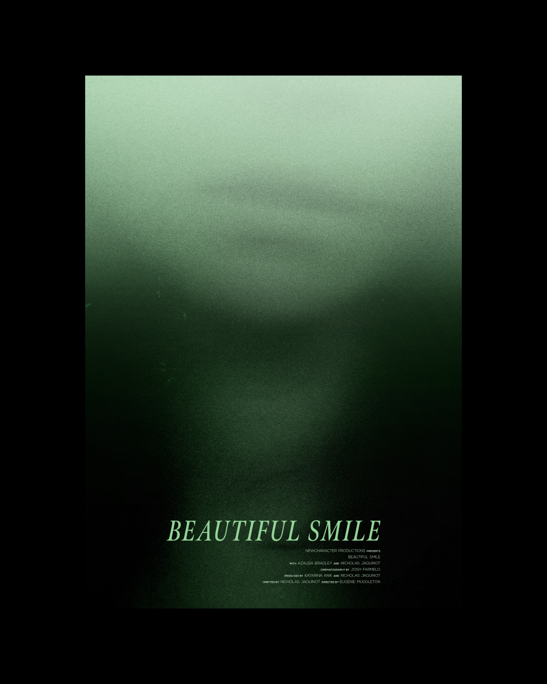
- Beautiful Smile, dir. Eugénie Muggleton
-
Film poster — design and development.*[also a labour of love where I served as producer across pre-production, production, and post-production.]
"A prodigious photographer crosses boundaries an aspiring model didn’t know she had — leaving her reeling in the aftermath and struggling to process where things went wrong."
Format: Short Film
Genre: Drama
Premiere: Austin Film Festival (US)
Key Screenings: Torino Film Festival (IT); Flickerfest (AU) -
-
Identity
Branding
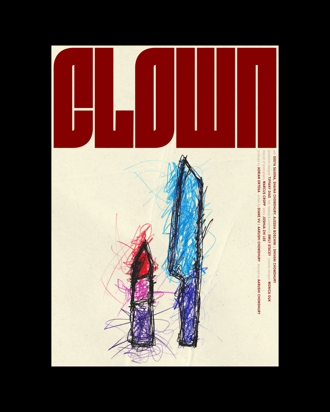
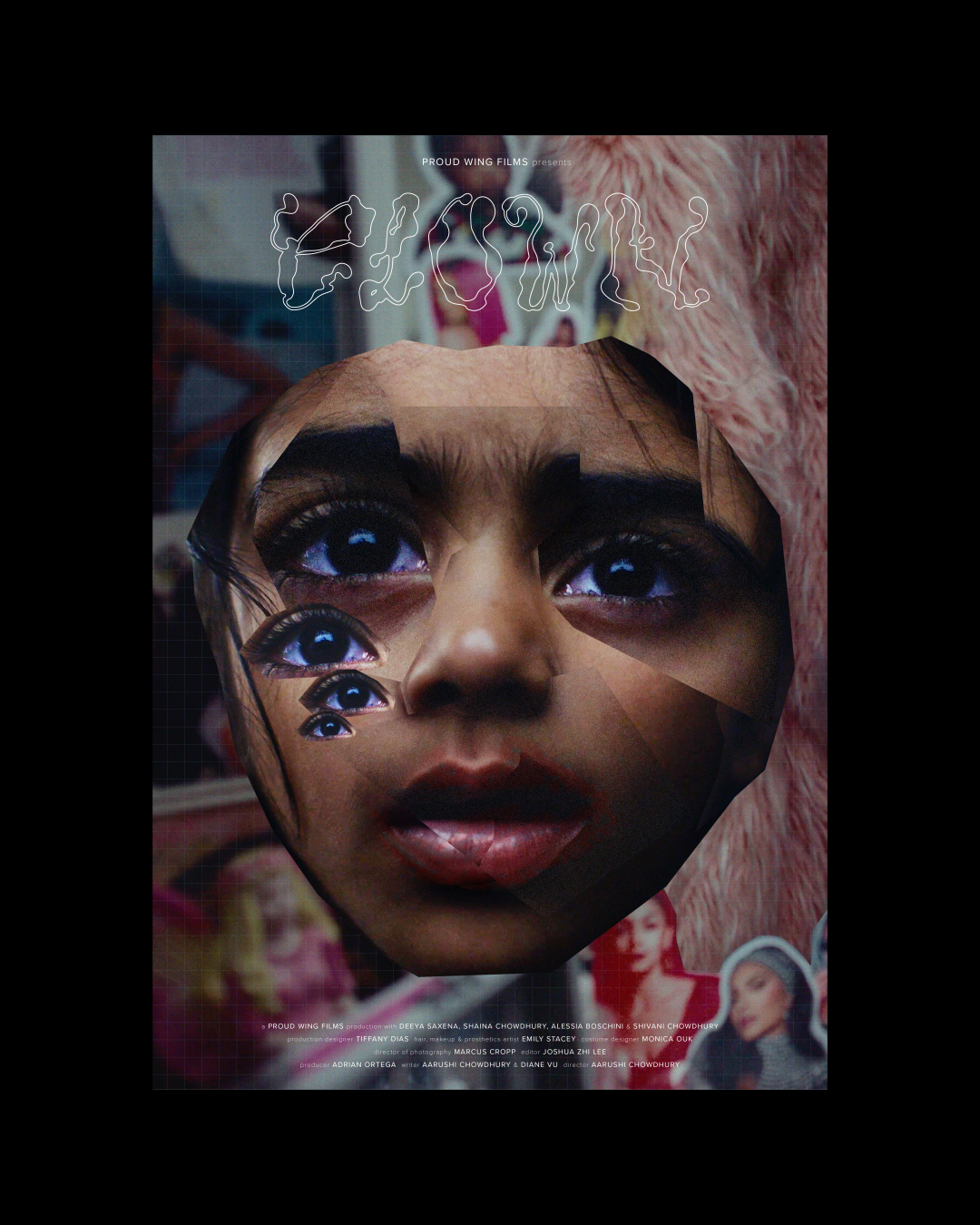
- Clown, dir. Aarushi Chowdhury
-
Film poster — design and development.*[final design followed by early concept, a collage-driven visual treatment leaning into the film’s horror elements.]
"Eight-year-old Sami can't wait to play "serial killers" with her older sister Jiya, but her sister-time is threatened when Jiya's cool new bestie arrives."
Format: Short Film
Genre: Drama
Premiere: SXSW Sydney (AU)
Key Screenings: Melbourne International Film Festival (AU); Cannes Indie Shorts Awards (FR); Byron Bay International Film Festival (AU); St Kilda Film Festival (AU)